
“A painting is worth a thousand confused art gallery visitors.”
the simplification of an art gallery website
The David Barnett Gallery is Wisconsin's premier gallery with the broadest range of art available in the region, including works of art that represent more than 600 artists. The David Barnett Gallery also provides professional art consultations, appraisals, restoration and conservation, custom framing, lighting, custom giclée printing, delivery, and installation services.

My Role
I was a designer on a team of five at the David Barnett Gallery
As a designer on this team, I was responsible for sketching concepts, conducting research to analyze feedback from users and company clients, designing wireframes, creating high-fidelity mockups, creating multiple design interpretations for testing, and persuading and presenting to the gallery owner.
I worked with two other designers, the gallery manager, and a representative from the other gallery departments.
Over the Years
2015 - 2020

WITHIN 5 YEARS THE Gallery HAD OVER 7 WEBSITE REDESIGNS
Clients of the gallery struggled with the website. Most clients felt that it did not represent what the gallery had to offer, that it was ugly, and very hard to navigate. The gallery owner was dissatisfied with the website. There were, however, aspects of the design that he did not want changed or discarded. Because of this, they would often change the website only to return to a previous or similar design.
WHO IS THIS FOR?
We made decisions based on current clients.
Most recurring clients were:
° 45+ years old
° Looking to purchase (expensive) artwork
° Gallery Night visitors
° Art Collectors or Interior Designers
° Living in Mequon or Whitefish Bay
The Problems
Gathering Feedback from Clients


“I can’t find anything. This website is too hard to navigate. There are way too many options and it isn’t very user friendly! ”
“Simply put, the website is boring and hard to navigate. There are too many options and not enough to keep me interested.”
Objectives
Limit menu options &
make website less crowded
Make website easier to navigate
Design a more interactive interface
Make the website more eye-catching
Original Wireframes
First, we made quick wireframes of two specific designs:
The one that the gallery owner preferred (left) and the one that most users preferred (right).
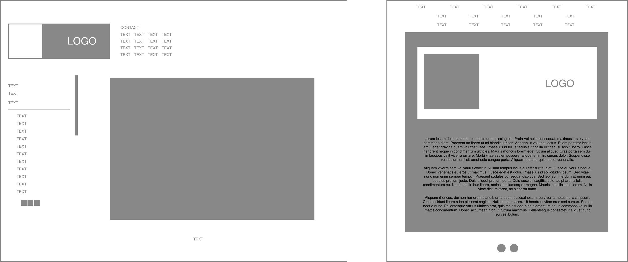
Users preferred how “beautiful” and immersive the second design was. It showcased the artwork in a space and had more photos of the gallery itself. They agreed that it was cleaner and easier to navigate.
The gallery owner liked that the original website had many options for clients to chose from and that the logo and menu followed the user around the various pages.
The logo
Then, we needed to update our logo.
I decided to look for consistency in other gallery assets and logos such as the David Barnett Design House (Design Department), Artist Resource Transglobal (David Barnett Non-Profit), and VanGo Frame & Art (David Barnett Framing Department).
The Wireframes
Then, we began creating wireframes for the update. In doing so, I keep a few things in mind:
The Gallery Owner Wanted
°A lot of menu options
°Large informative paragraphs
°Fixed position for logo and menu
The Users Wanted
°Less menu options for easier navigation
°A simple yet beautiful interface
°Photography of the gallery and artwork

A challenge: Fighting for the user
Balancing user needs and what the gallery owner wants
My role was very challenging; I had to convince the gallery owner to allow certain decisions based on critical research that we conducted and direct user feedback.
For example:
Users wanted less menu options and the gallery owner wanted as many as possible! In order to convince the gallery owner, I created a presentation of the various user needs, the goal for our website, and the how these designs would help us achieve that goal.
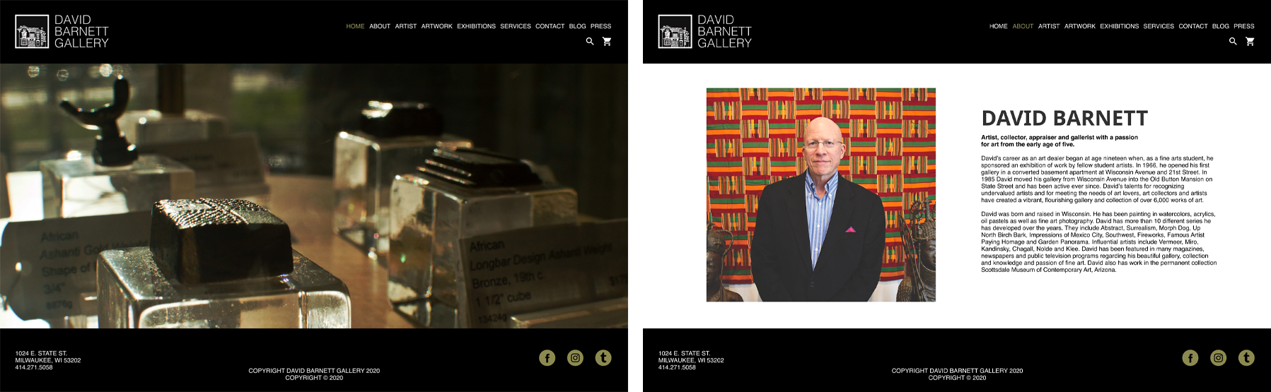
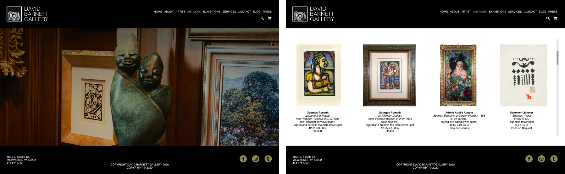
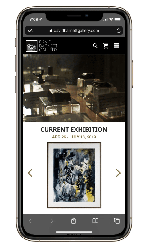
Final Products
Desktop site

Mobile Site

Important note
Social Media Restrictions

I explained to the gallery owner that these social icons cannot be altered to the color shown above. While I agreed that showcasing them in this color helps the composition, I also argued that having them in white would not only satisfy the legal requirements of the brands, but would also compliment the current layout.
This is definitely a change I would make right away.
My thoughts
Results, reflections, and insights
Before this, we had only ever sold two artworks online. We noticed an immediate increase in online sales. We sold 17 artworks in two months.
Be the voice for those going unheard! As a designer, I am responsible for voicing the concerns and desires of the user! Though the gallery owner has the final say, it is important for me to speak on the user’s behalf.
The power of persuasion. I was proud of myself because I stood up for what I believed to be true based on our research and was able to convince the gallery owner.